
Good Design Improves Lives
 |
||||||
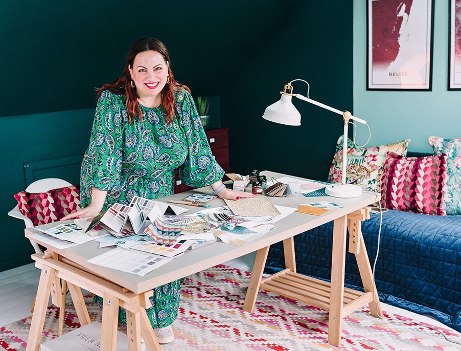
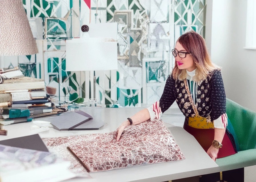
| An AI generated image of an interior designer working at a desk, based on a photo of Louise | ||||||
|
One of my interior design colleagues in the States recently had a phone call with a potential client, and everything seemingly went well. A week went by without her hearing from the client, so she followed up to see if they still wanted help, and the client replied: |
||||||
| “We are trying the AI approach at first to see if it meets our needs” | ||||||
|
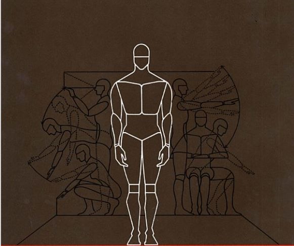
This is the first time this designer has had someone turn down her services in favour of using AI to design their home, and it’s the first time I’ve heard of this happening. As a community of designers, we have been talking about AI's potential significance for our profession for quite a while, but this is the first real evidence of its impact on our industry. So what does this mean? Can AI really replace the work of an interior designer? I thought I’d have a look at this as I’m sure it will come up with clients again. My initial thoughts were that most clients I’ve come across have trouble making decisions and narrowing down the many choices and options available to them, which is why they come to a designer - so will having more options and seeing more possibilities help them? For those of you who aren’t sure what AI is, it stands for artificial intelligence and whether we know it or not, we have all been using it for years. Anytime you’ve typed a message on your phone and it has finished the sentence for you, anytime you have used Google image search to find something which looks like a photo you have, or anytime you’ve had an interaction with one of those annoying chatbots when you visit a website, you’ve used AI. It can be really useful - it helps us navigate the roads with intelligent maps, you can use it to edit the photos on your phone to make sure everyone is smiling at the same time, and we even use it here to automatically explain our bank transactions in our accountancy software. It’s very powerful and will only get better and better. So how can it be used to help you design your home? |
||||||
| There are many apps and websites (both free and paid) that all say they will help you design your dream home, so with an open mind I thought I’d try them out and let you know my thoughts. Most of them work with the ‘prompt’ method, which means that you type in words or sentences to describe what you are looking for, and then they generate a few images showing you different versions of a room which resembles your prompt. For example, you might write that you want to see a living room in a maximalist style using a blue and red colour palette. You will then get a few images which have been generated by AI, usually by using photos of existing rooms and mixing them together with imagined elements to make the new room. | ||||||
|
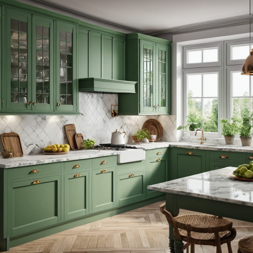
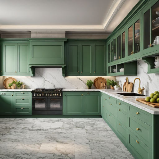
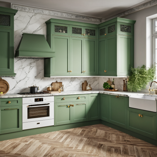
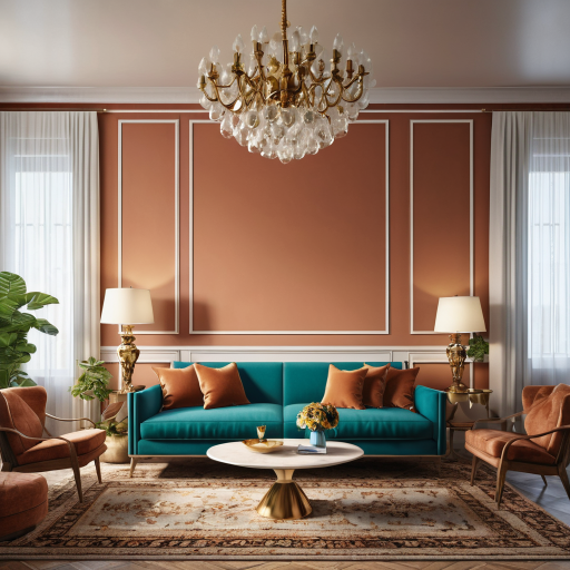
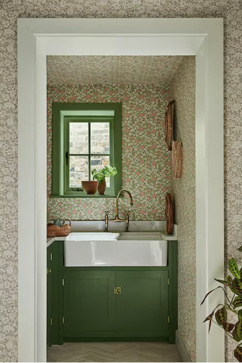
I searched for a suitable AI image generator to try and found a free app called PromeAI and gave it a go. I typed the prompt ‘interior traditional kitchen with green cabinets and marble worktops’ and got three images in around a minute (the paid version will generate them more quickly). Here are the three images the AI tool came up with: |
||||||
|
||||||
|
As you can see, the images are all quite similar, with the same style of kitchen, the same shade of green used on all the cabinetry, and similar flooring. Overlooking the slight technical problems (cabinets with handles that don’t seem to be attached to them, cabinets with doors that don’t cover the whole cupboard, an extractor fan which doesn’t have any depth for the pipework), I wondered if these images are actually useful to someone trying to design their home? I personally found them quite uninspiring, as they were all so similar and didn't have many other colours or materials in them, and very little else of interest. But, if I was struggling to imagine what a green kitchen with marble worktops could look like, then these images could be useful. They could even be shown to a designer and used as a starting point for the design to develop, and I often work this way using Pinterest instead of AI with my clients. I use it to help kickstart the design conversation around the potential style of client’s homes, and it is extremely useful. Could AI be helpful to use in this way, as part of the design process? I decided to run the exact same prompt through Pinterest, to see what it came up with. I got a variety of different images which popped up in seconds - here are a few: |
||||||
|
||||||
|
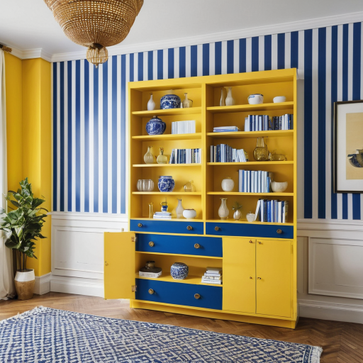
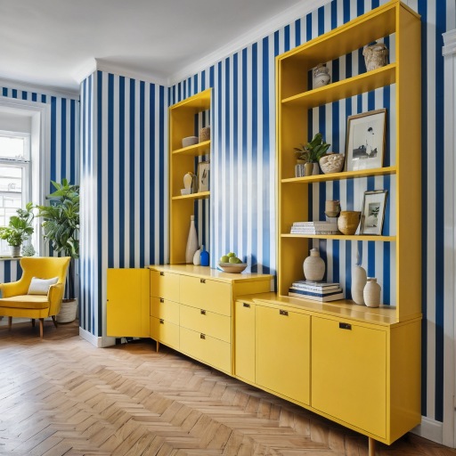
The images from Pinterest were much more diverse - the styles and layouts of the kitchens were all different, and there were elements in lots of the images which I liked and could pick and choose from. Even though all the kitchens are traditional in style, they each have a different mood and feeling and would help me to narrow down what I was actually looking for. For example, do I want a dark green kitchen? How do I feel about tiles all the way up to the ceiling? These images sparked questions which would help me get closer to my dream kitchen. So far, Pinterest was proving more helpful than AI. But then I considered that perhaps my kitchen prompt to AI wasn’t the most inspiring, and that was causing the images it generated to be dull. I asked our admin assistant, Cerys, to come up with a different prompt for AI to use. She has been considering decorating her living room with a blue striped wallpaper and having yellow cabinets built into the alcoves, so she suggested I try that. Her prompt was ‘living room with blue and white striped wallpaper with yellow built-in cabinets in the alcoves’. Here are the images that AI generated: |
||||||
|
||||||
|
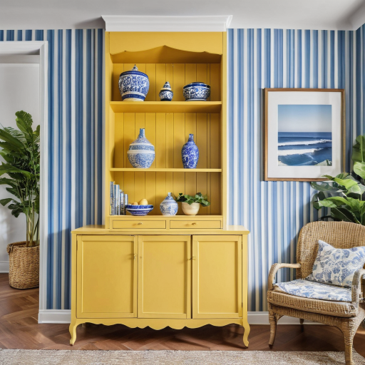
Again, there are technical details that the AI has struggled with, but we can overlook those. My main concern was that the images are all very similar to each other - the same shade of blue in the wallpaper, the same colour on the yellow cabinets, and they are essentially three versions of the same thing. Cerys looked at this and wasn’t inspired at all, in fact, she said it might put her off decorating her living room! So I ran the same prompt through Pinterest to compare the results. Here are a few of the images: |
||||||
|
||||||
|
She could see some elements she really liked - the paler blue wallpaper, the difference in the stripe widths which made her consider how wide the stripes would be in her room, and she also liked that the design styles are varied (Mid Century, traditional and Scandi influenced). She even liked the paler blue built-in cabinetry, which helped shape her vision for the room, as she is now considering blue cabinets instead of yellow. A much more satisfying exercise in terms of inspiration. |
||||||
| At least for the moment, Pinterest is a better resource for ideas, as it shows you options around your starting point. AI so far had just given me back exactly what I asked for, and nothing more. It showed me what a room like this could look like, but if I weren't a designer, I might struggle to relate this to the shape and layout of my own kitchen or living room. Even though a lot of the images on Pinterest these days are AI generated and don’t exist in real life, the algorithm showed me possibilities and opened up my thought process. | ||||||
|
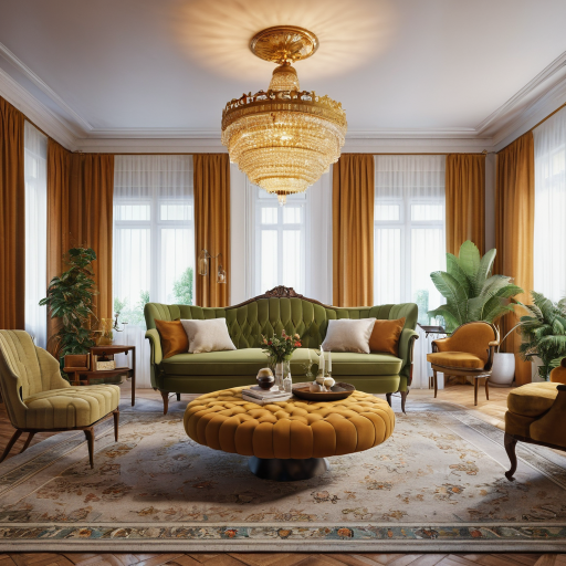
I needed to try a different approach with my experiment if I was going to see how useful AI is for interior design. One challenge which crops up often when I work with couples is that one person will prefer a completely different design style from the other, and marrying those two styles is part of my role in shaping their homes. I need to be able to understand two opposing genres and merge them in a way which satisfies both halves of the couple and looks stylish and cohesive overall. I am working with a couple right now who prefer different styles, so I thought I’d run their preferences through AI to see if it could help. The prompt I input this time was ‘a large living room which mixes Mid Century and Rococco design styles’ and here is what I got: |
||||||
|
||||||
|
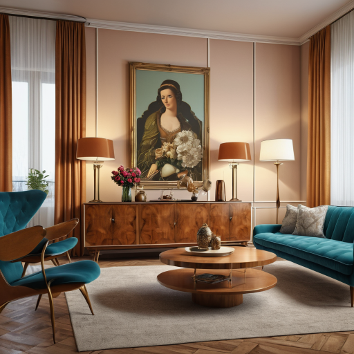
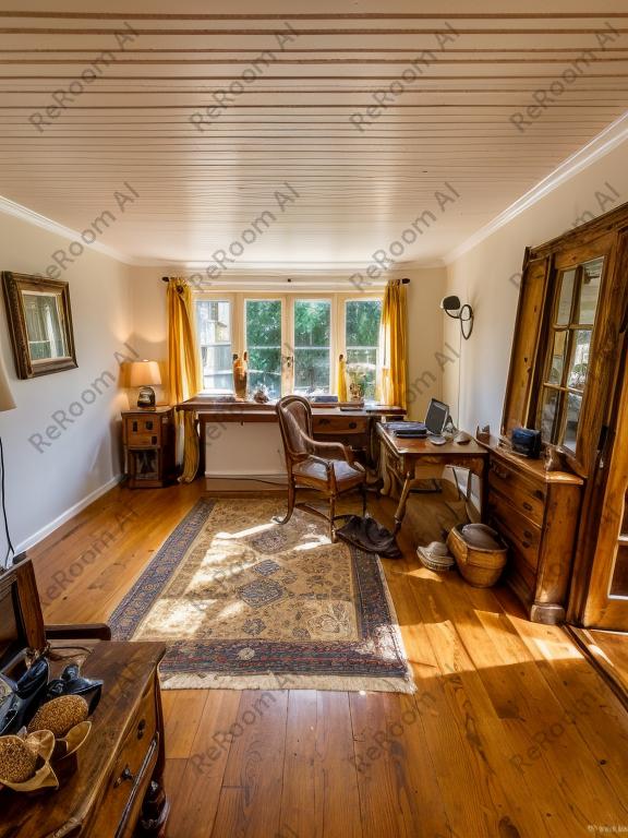
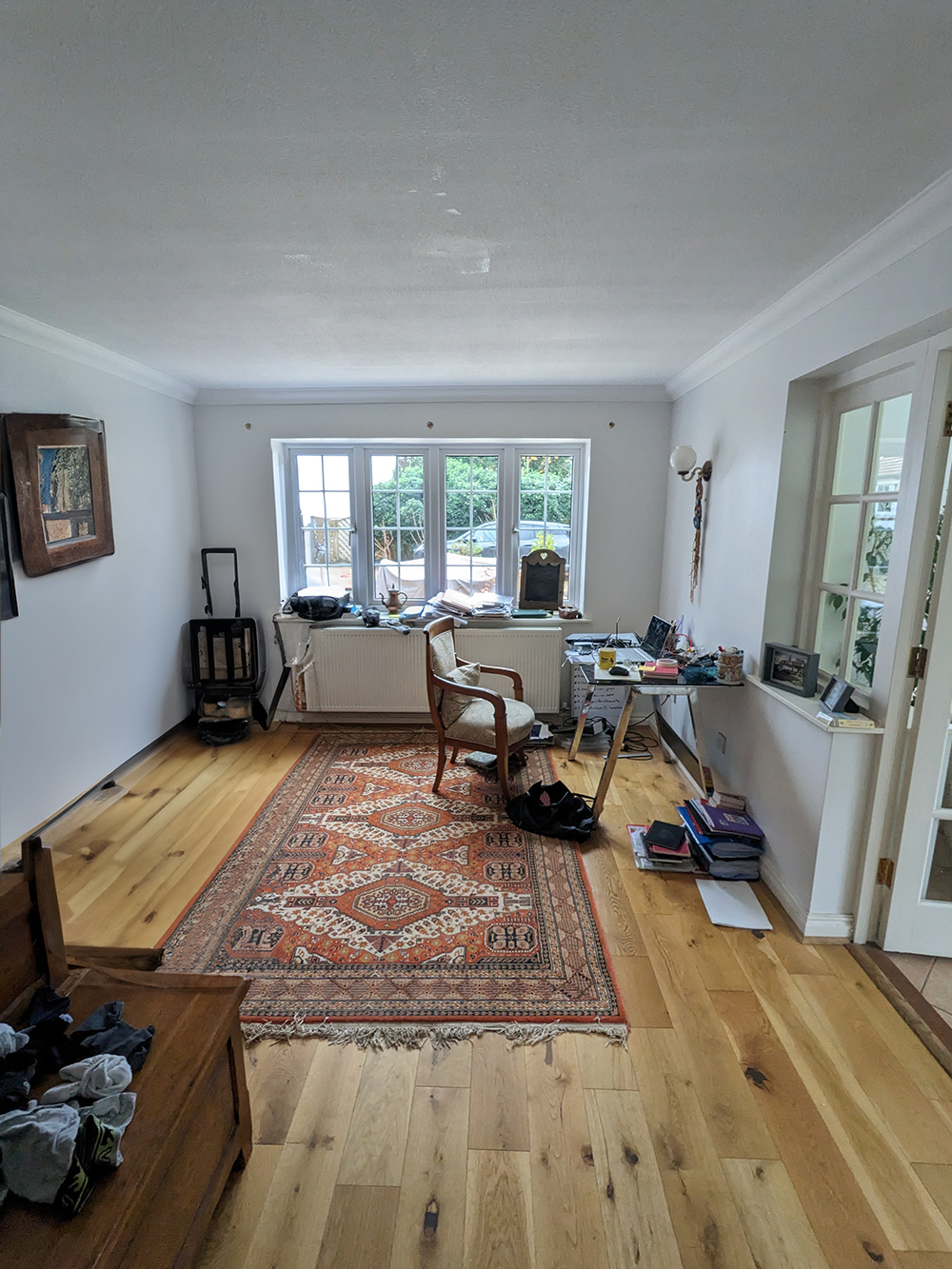
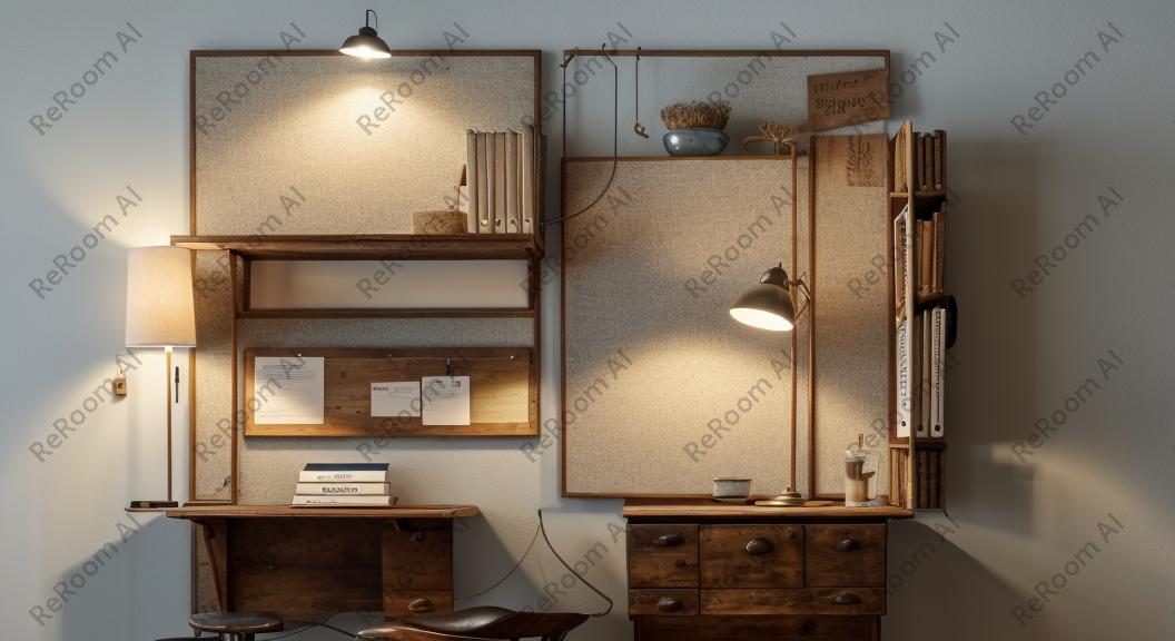
I thought these looked pretty good - they are warm, pleasing to the eye and look like a successful marriage of the two styles. On closer inspection, I could see that the first image was mostly made up of Rococco style furniture and lighting, with little of the Mid Century in it. The colour palette is typically Mid Century, but would that be enough to satisfy the one half of the couple who really wanted a Mid Century room? The second image definitely has more of a Mid Century feel, but much less Rococco, so it might suffer from the opposite problem. I also noticed that the furniture was a hybrid of Mid Century shapes with Rococco styling, something which I’ve never seen anywhere in real life (I’m not sure it even exists), so if we were relying on the furniture to mix the two styles, my couple might be disappointed. The third image is more successful at mixing, but again it uses furniture that doesn’t exist and there are a lot of Rococco inspired pieces used to create the overall design feel. I think that until AI can really understand the characteristics of a design style, and not just merge images of each style, it wouldn’t be useful to homeowners who are trying to keep both parties happy. So far, we’ve been looking at AI which can provide inspirational images, but it can also do much more than that. There are some apps which say they can create a room image from a floorplan, or from a photo of a real room, so I thought I’d try them out too. I used a photo of an existing home office from a real client of mine, and uploaded it to a tool called ReRoom AI. I chose creative mode, added the room type (home office) and could pick one of the 24 design styles. I chose ‘French Country Charm’ as that was the closest match to my client’s design style. I could also pick a lighting style (ambient), a colour theme (blue) and a texture preference (wood). Here’s the ‘before’ picture of the real home, and the first image it generated: |
||||||
|
||||||
|
The first image is an office with a desk and chair, and you could say that ‘French Country Charm’ has been added in the wood textures and overall rustic feel. There is no evidence of a blue theme (my client’s favourite colour), and the window into the conservatory had been turned into a mirror. What I couldn’t tell the app was that the client and I had discussed moving the desk in front of the window so she would have a nice view when working, as the ability to add a prompt is a paid option. The app asks if you are satisfied with the result and offers another try if you aren’t, so I ran it through again. This was the result: |
||||||
|
||||||
|
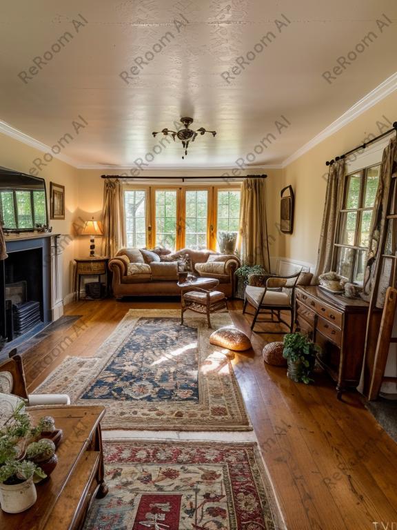
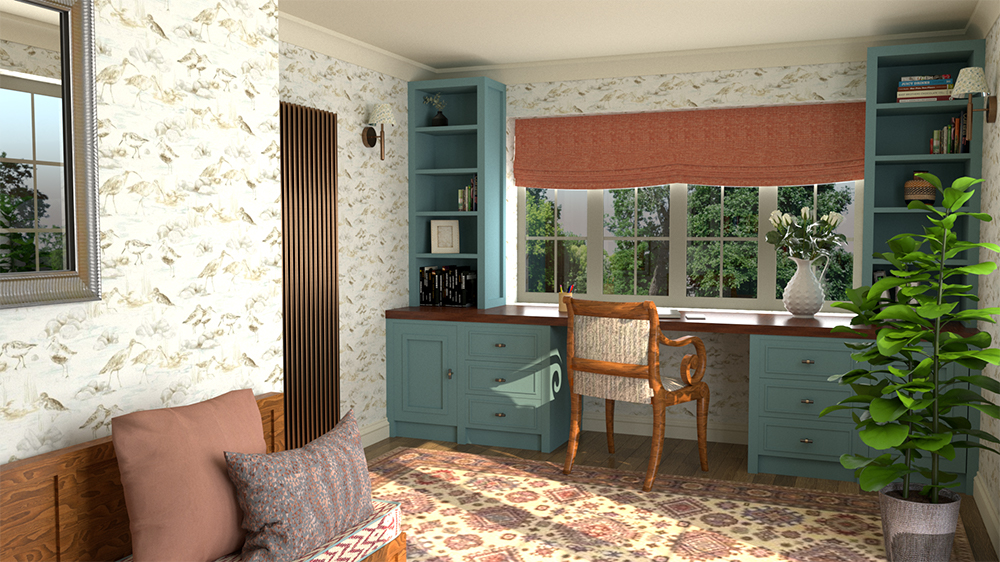
This time it’s worse, as it’s now a living room, a fireplace has been added where one couldn’t exist, and the short wall under the conservatory window has been turned into a wooden chest of drawers. The office chair has two legs with no back and there appears to be a large loaf of bread on the floor! Clearly, this technology isn’t perfect yet, but these glitches will eventually be ironed out. My main concern here is that the AI hasn’t been able to take a brief from the client and consider what she wanted this room to be and how it would work for her. There are no creative solutions which meet her needs, with much of what is being suggested impossible on a practical level. How would my client implement a design like this in her home? For comparison, here’s the real design I created for her, which not only addresses her needs, it adds creative solutions and style just for her: |
||||||
 |
||||||
| our design for our client's home office | ||||||
|
ReRoom AI also has the ability to take a floorplan of a room and generate an image based on it. I thought this could work really well, as I find most of my clients struggle to visualise a floorplan as a real room in 3D (this is why I create 3D models for them so they can see the rooms as they will look when built). I uploaded a floorplan of the home office I had designed for my client and added the same theme, lighting and colour as before, this time using ‘preserve details’ mode. Here is the new AI generated floorplan: |
||||||
 |
||||||
| The AI generated floorplan of the home office based on our floorplanfrom ReRoomAI | ||||||
|
I was a little disappointed with this as it has taken away some of the important furniture (such as the desk under the window) and has just given me a slightly better looking floorplan with some colour added. Again, I was worried that my poor results might be down to my lack of experience with AI, so I tried again, this time using the ‘creative mode’, and this is the result: |
||||||
 |
||||||
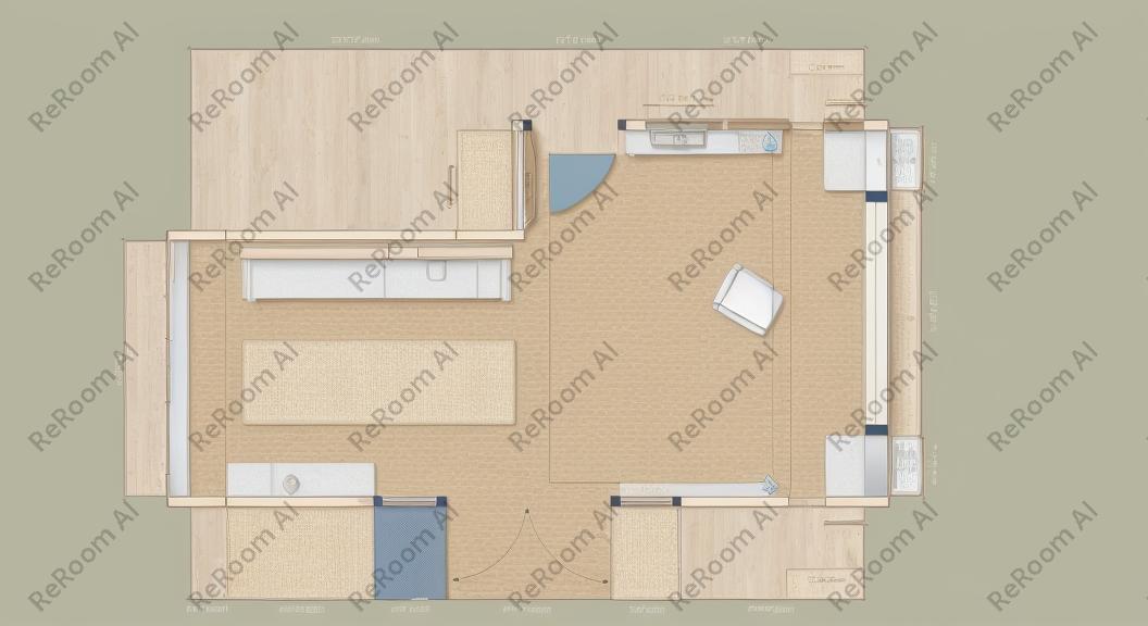
| The AI generated floorplan of the home office floorplan showing the lines as shelves from ReRoomAI | ||||||
|
ReRoom has taken the lines of the floorplan and turned them into shelving above a desk. It’s still a home office, but not a very helpful image, and if I were a client it would leave me completely stumped as to how to improve my home office. Even if you did manage to create an image which looks how you want it to, how would you know where to find the items in it? They don’t exist, and you would struggle to use AI to tell you how the sofa you see will feel to sit on, or what it is made of, and how it will stand up to your kids jumping on it for the next ten years. It’s clear that AI can’t yet redesign the layout of your home, or tell you which wall to knock down to create the perfect open plan space, but these things will come in time. My main issue with using it for interior design is that it cannot create an individual and personal response to the home, to the people who live in it, their needs, and their surroundings and lifestyle. We need human input to do that, and need humans to process the often confusing and contradictory information which is given to us as designers. AI certainly can’t understand the things that clients don’t say when we are taking a brief, and can’t spot the clues that clients give us without realising, and use them to create a cohesive design for us. Once the designs are completed, AI can’t hold your hand through the professional process of implementing those designs and guide you through to the end result. I think that AI is a useful tool like any number of things which help you on the design journey (such as magazines, Pinterest, films, travel, and the natural world), but at the moment it can only be as good as the human input it receives, and it relies on what humans do with the output. I decided to ask ChatGPT (a text based AI tool) what the difference between AI interior design and a human interior designer is, and here is the response: "AI interior design typically refers to the use of algorithms and software to assist in the design process. This involves generating design recommendations based on user preferences, analyzing spatial layouts, suggesting color schemes, and even creating virtual 3D models of proposed designs. On the other hand, a human interior designer relies on their creativity, experience, and understanding of design principles to conceptualize and execute interior spaces. They often work closely with clients to understand their needs, preferences, and budget constraints, and then develop personalized design solutions accordingly. Human designers also bring a unique sense of aesthetic judgment and emotional intelligence to the design process, which can be challenging for AI systems to replicate. While AI can streamline certain aspects of the design process and offer valuable insights, human interior designers often excel in areas such as empathy, intuition, and the ability to adapt creatively to diverse client needs and preferences. Additionally, human designers can provide a level of personalization and attention to detail that AI systems may struggle to achieve." |
Welcome to the design blog, where you'll see posts about anything from the projects we are working on, to the latest fabric and wallpaper collections, and all things interiors related. We love colour, pattern, architecture and old buildings, and we love to share our finds with you.
Happy reading!
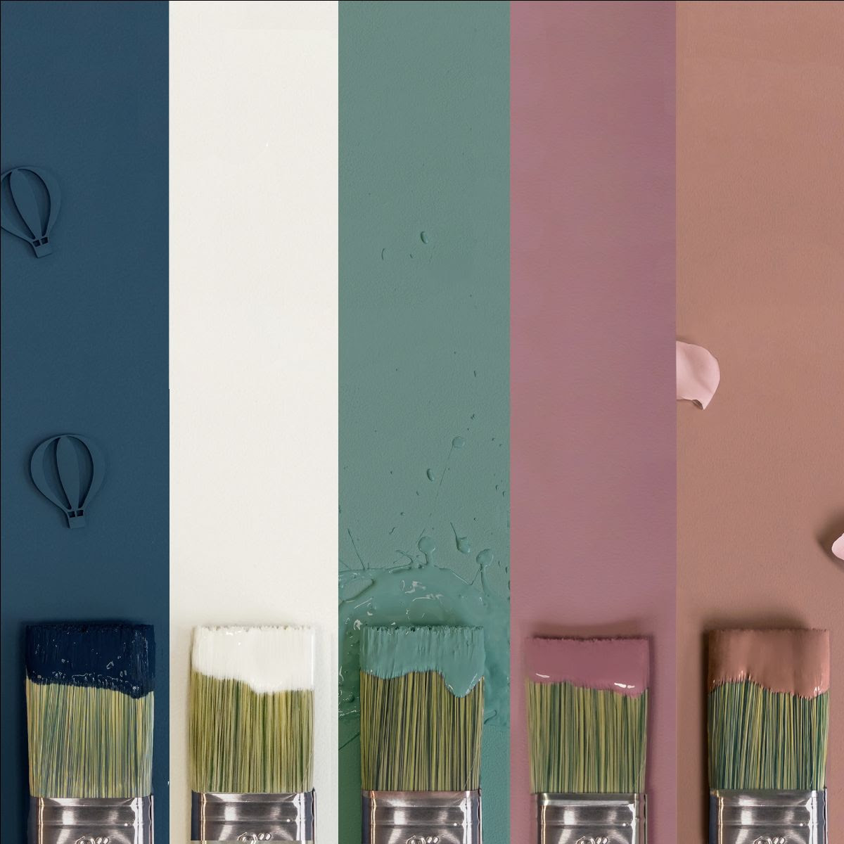 |
| A collection of five brand new environmentally friendly paint colours from Earthborn. With names like 'Splashing', 'Balloon Ride' and 'Bunny Hop' they are designed to appeal to all of our five senses, and are almost good enough to eat. Available in all interior finishes, you can see the collection here. |
 |
| New from one of our favourite brands, outdoor fabric from House of Hackney. Their colourful prints are durable and colourfast, so they are perfect for use outside, and the sun (if we get any) won't fade them. You can see the outdoor collection here. |
 |
| A new product from one of my favourite designers - the ever so versatile Direktors Lampa from Beata Heuman. It has an articulated joint on the base and a directional shade holder, so you can move this lamp into the perfect position, whether that be for work or play. |
 |
|
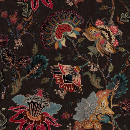
Little Greene have launched their latest collection of wallpapers in collaboration with the National Trust and they are just gorgeous. Featuring eight historic wallpaper designs that have been created from original patterns found at several of the National Trust’s historic houses, the collection comprises an array of exotic birds, stylised florals and large-scale tropical murals. You can see the collection here. |
 |
|
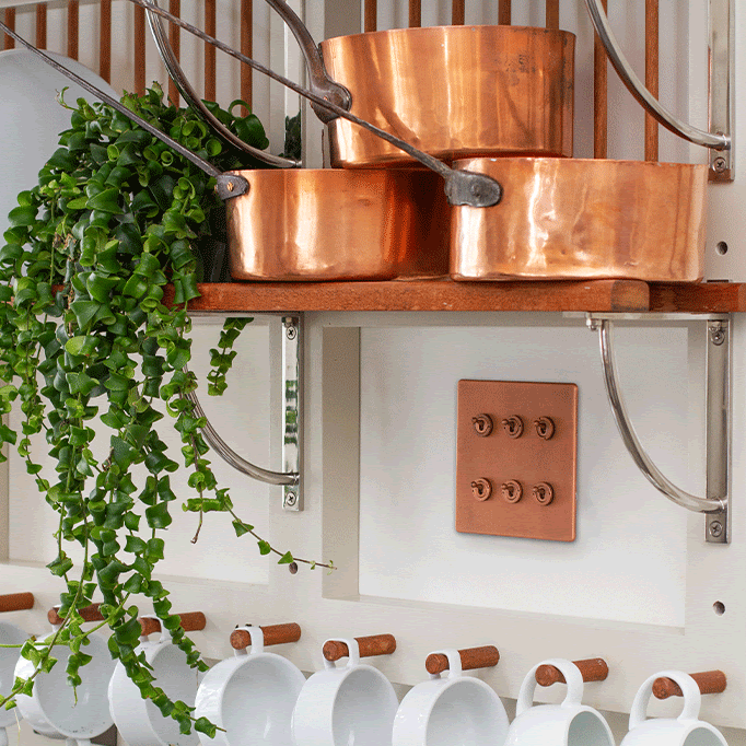
Add some warmth and interest to your interiors with the Autumnal hues of antique brass, copper and brushed brass light switches and plug sockets from The Soho Lighting Company. Our favourites are the antique copper collection, as they are hand finished to replicate the aged tone of Victorian cookware. |
 |
|
Well known paint brand Mylands have created an innovative new paint range made from ground olive stones. Using a waste product and turning it into an eco friendly paint is genius as it has virtually no VOCs (Volatile Organic Compounds) and creates minimal environmental harm. It is available in all their beautiful colours, and will leave the air in your home purer after decorating, meaning you and your loved ones will benefit too. |
 |
|
kirkby design's latest range is a happy collection that not only looks good but does good too. Created using 100% recycled cotton yarn from the fashion industry these eco-conscious prints are the perfect way to bring a splash of colour into your home this Autumn. |
 |
|
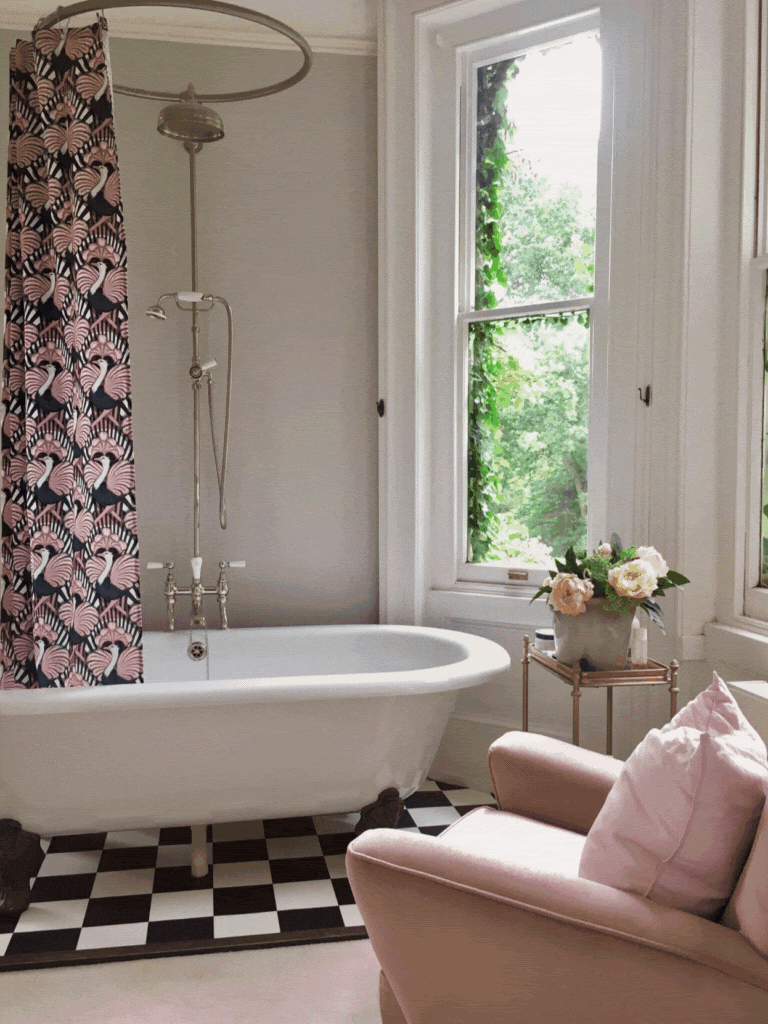
Who says shower curtains have to be white (or greying with mould)? The fabulously patterned range from Divine Savages is a bold and easy way to add a wall of colour and pattern to your home with no commitment. Very easy to change, and very easy to fall in love with too! |
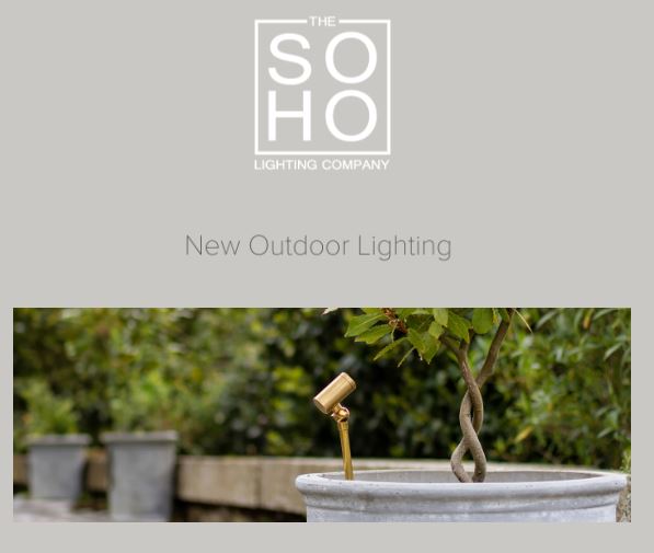 |
| Outdoor lighting is not usually something to get excited about. But this new collection from Soho Lighting is beautiful, and in on trend but timeless brass. Inspired by the Chelsea Flower Show and designed to compliment any style of planting, there are three new lights in this collection. They are all made in Britain and you can take a closer look here. |
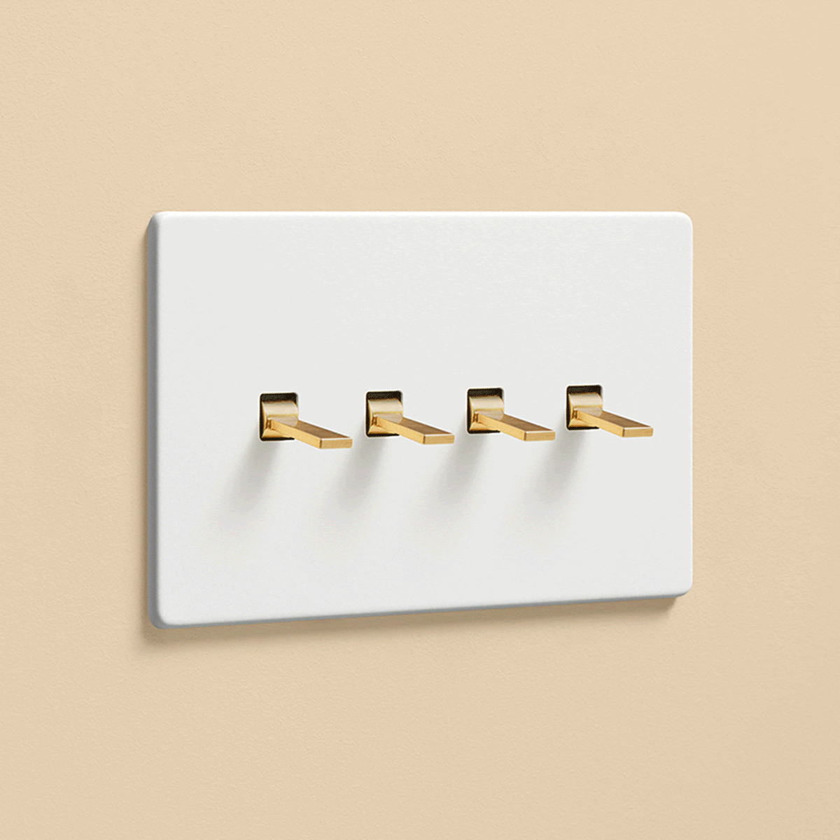 |
| We often have lighting combinations in our rooms (such as kitchens) where some lights need to be dimmable, (say over the dining table) and others need to be a functional on or off switch. The clever people at Dowsing & Reynolds have combined these types of switches into one plate, which is not only practical but stylish too. You can see the range of switches and finishes available here. |
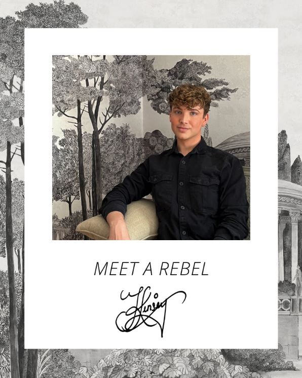 |
| If you are a fan of the BBC's Interior Design Masters, you'll recognise Jack Kinsey, the runner up in the final of this year's show. He was our favourite to win, and is incredibly talented. It's lovely to see him team up with one of our wallpaper suppliers, Rebel Walls, to create a hand painted bespoke mural collection which brings the best of the past into the present. You can see the collab here. |
 |
| One of my favourite maximalist brands, House of Hackney, have released a stunning new collection of heritage tiles based on their most popular floral design, Artemis. They are hand made and traditionally glazed, and come in a rainbow of signature House of Hackney colours. You can buy the tiles here. |
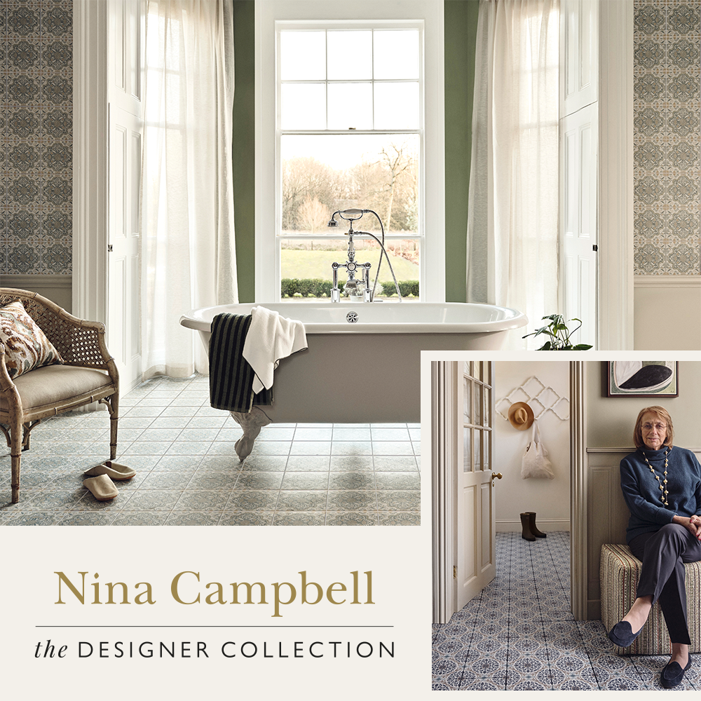 |
| One of the best known interior designers, Nina Campbell, has collaborated with one of my favourite tile suppliers, Fired Earth, to produce an elegant range of beautifully patterned tiles, and a complementary range of understated plains. They are designed in her signature style, and are very easy to mix and match to create a relaxed look in your home. You can see the collection here. |
 |
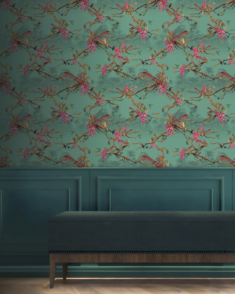
| A new collaboration from Little Greene and the National Trust, a collection of wallpapers spanning over 200 years of decoration. The designs have been created from original papers found at three of The National Trust's historic houses, and printed using traditional techniques. The collection includes hand painted birds and stylised florals, and comes in 45 colour ways. You can buy the collection here. |
 |
| New from one of my favourite wallpaper suppliers, Woodchip & Magnolia, comes a long awaited collection of 18 bold and beautiful cushions. Inspired by some of their best selling wallpaper designs, they are made in tactile velvet and feature a pattern on one side and a coordinating plain on the other. You can see the collection here. |
 |
| One of my favourite paint suppliers, Fenwick & Tilbrook, have just released 5 new colours. Named lovely things like Tarnished Brass and Spring Puffin, these warm, muted shades have been mixed by eye and are perfect for creating cosy, cosseting homes. You can see all their colours here. |
 |
| It just so happens that I'm excited by newness from Mullan Lighting again this month. They have launched a fabulous colourful series of wall lights, with celestial names like Mars, Neptune and Jupiter, and I just LOVE the use of colour in them. You can see the range here. |
 |
| The brand new Altus and Betty ranges of pendants from Mullan Lighting are beautiful, but we are also excited about them because they are handcrafted from rattan and abaca, which are sustainably sourced materials. You can see the Altus collection here, and the Betty collection here. |
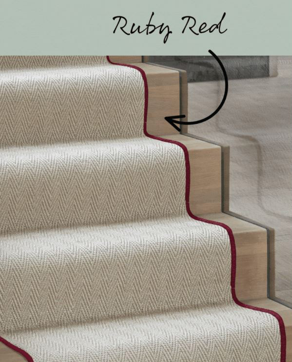 |
| A colourful innovation from stylish flooring brand Alternative Flooring - you can now add a colour of your choice to the edges of any stair carpet runner they are making for you, taking whipped edges from ordinary to full of fun. |
 |
| New from lighting brand HouseOf, a responsibly made eco table lamp. Made from recyclable and waste materials, and designed and made in London, they will even take it back within the next ten years in exchange for 20% off another one of their products. You can learn more here. |
 |
| A new fabric from Kirkby Design called Sculpt includes these deep pile cotton velvets which look just like large versions of corduroy. The look takes me right back to my childhood, and is very comforting. You can see the collection here. |
 |
| The trend for super soft Boucle fabric is still going strong, but up until now we've mostly seen it in creams and whites. One of my favourite fabric suppliers, Linwood, has produced a new colourful collection of 48 shades. It's a durable and soft fabric, and works particularly well on sofas and cushions. |
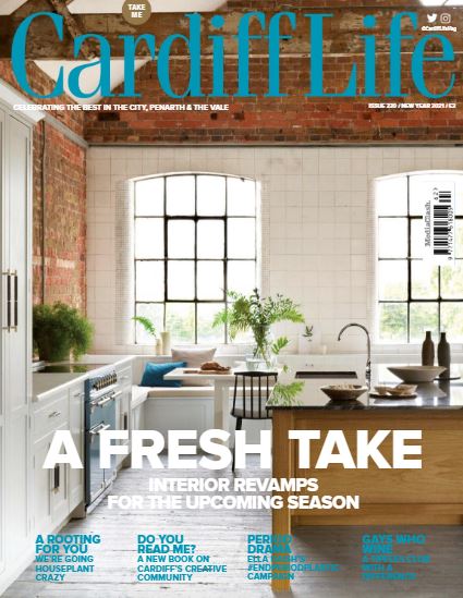
| This month, we were pleased as punch to receive the Best Homes & Interiors award from the prestigious Cardiff Life Awards. Cardiff Life Magazine are well-known champions of our city, and the annual awards celebrate the best of Cardiff talent, so we are over the moon to be named 2022 winners! |
 |
| The designs of William Morris have made a comeback over recent years, and now they have been given a striking makeover by interior designer Ben Pentreath. The Queen Square Collection has reimagined some of Morris's most famous fabrics and wallpapers in rich tones and vibrant colourways. You can see the collection here. |
 |
| One of my favourite design houses, Woodchip & Magnolia, have gone all out for the all over pattern trend and produced wallpapers and fabrics in the same prints, which I love. You can see the whole stunning collection here. |
 |
| A new collection of sumptuous fabrics has just been released from Prestigious Textiles, called Monsoon. The collection includes tactile velvets, animal motifs, embroideries and beautiful sheers, so it's versatile enough to use anywhere in your home. If you'd like to know more about these fabrics, please get in touch. |
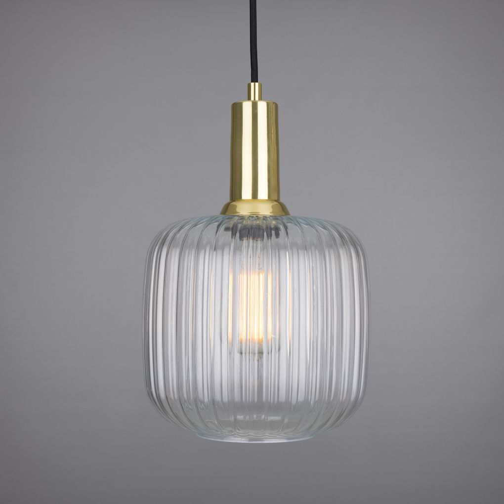 |
| Lighting designers and manufacturers Mullan Lighting have a new range of reeded glass pendant lights available. These Mid Century inspired lights come in three shapes and four finishes, but the Nahla (the one pictured above) is my favourite. You can see the range here. |
 |
|
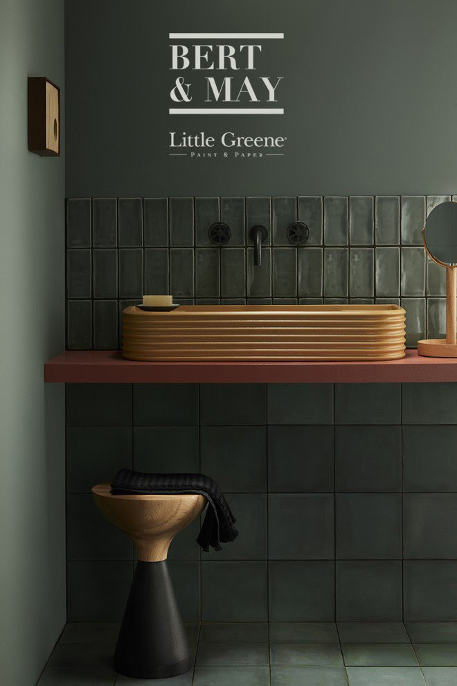
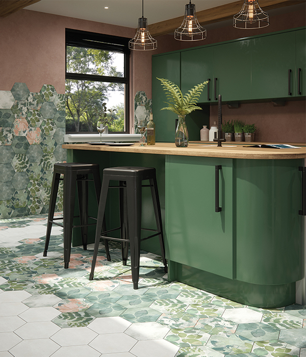
Little Greene has announced a collaboration with tile brand Bert & May. The collection sees eight gorgeous Little Greene shades translated onto tiles, giving you even more opportunity to add colour, texture, and a mix of materials to every area of your home. I love this bathroom combination above, with the perfectly matched tiles and paint offset with touches of terracotta, mustard and oak. You can see the full collection here. |
 |
|
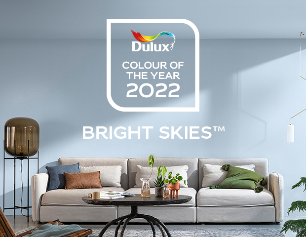
So, Dulux have announced their colour of the year for next year, and here it is! Bright Skies is described as the 'breath of fresh air' that we all need after being indoors for so long. What do you think? I'm reserving judgement at the moment. It looks a little cold in the picture, but I don't think the beige sofa and the styling are doing it any favours here. Maybe colour drenched (painted on walls, ceilings, trims and doors) and with some warmer burgundies and terracotta, it could be lovely. You can buy the colour here. |
 |
| British singer songwriter Paloma Faith has recently launched her first collection for the home. It includes wallpapers, fabrics, cushions and bedding, and she describes the look as 'faded grandeur and retro maximalism'. The prints are everything I love - dramatic, colourful and fun, and you can see more of the collection here. |
 |
| I was watching an Instagram live post from The Little Greene Paint Company last week, and they were discussing a comeback for yellow. Now, as you know, I don't think you have to follow the trends but yellow hasn't been fashionable for a long time, so this sunny, uplifting shade is often overlooked. A warm yellow like Little Green's Carys (above) is perfect for cheering us all up, and you can buy it here. |
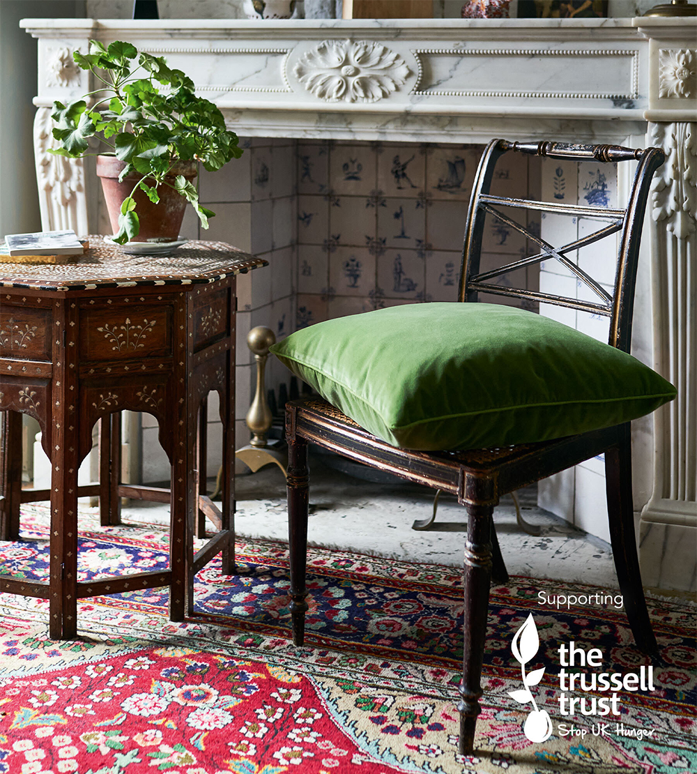 |
| Introducing the cushion that gives back, from homewares company Oka. They have produced this cushion in partnership with The Trussell Trust who support two thirds of the UK's food banks, and 100% of the proceeds from sales of this lovely green velvet cushion will be donated by Oka to The Trussell Trust. It comes in a range of other colours too, and you can buy the cushion here. |
 |
| Just launched, Ca Pietra a new tile collection in collaboration with the National Trust. Every tile has been inspired by one of the historic properties, gardens or coastlines looked after by the Trust, and a minimum of £10,000 from sales of the tiles will be given to the National Trust to help them continue their important work. You can see the collection here. |
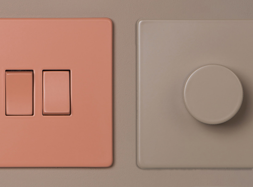 |
| Did you ever think that your light switches were good enough to eat? I'm guessing the answer is no, until now. You can now buy switches and sockets in these gorgeous colours from the new Dowsing & Reynolds Cafe Culture collection. They come in luscious shades like Cinnamon, Caramel Latte and Whipped Cream, so you can tone, coordinate or contrast with your wall colours and make every part of your interior scheme look delicious. You can buy the gorgeousness from here. |
 |
| A beautiful new sustainable fabric range from Clarke and Clarke has just been launched. It's made entirely from recycled materials so you can refresh your home with a clear conscience. You can have a look at the fabric here. Get in touch with me if you'd like to buy any of this fabric. |
 |
| This month I want to highlight a business run by a very talented lady I met a few years ago (remember when we could meet people?) Not only is she a creative interior designer, she also runs an online shop where she reuses and repurposes anything from soft furnishings to larger furniture items. Everything sold is bespoke and unique, and is effortlessly waste conscious because it's being used again. You can visit her shop here. |
 |
| Thanks to a genius idea from kings of pattern Blackpop, you can now have one of their colourful designs on your kitchen worktop. They will put any of their funky fabric or wallpaper designs onto waterproof MDF to make you a unique worktop, or they can even make a design just for you. Chopping will never look the same again! You can buy the worktops from their website here. |
 |
| This month's issue of Cardiff Life Magazine is out today, and features an interiors special, because one thing this past year has made us do is take a new look at our homes and how we'd like to live in them. To see what I and other local interiors experts have to say on the subject, including a round up of the trends for 2021, have a flick through the digital mag here. |
 |
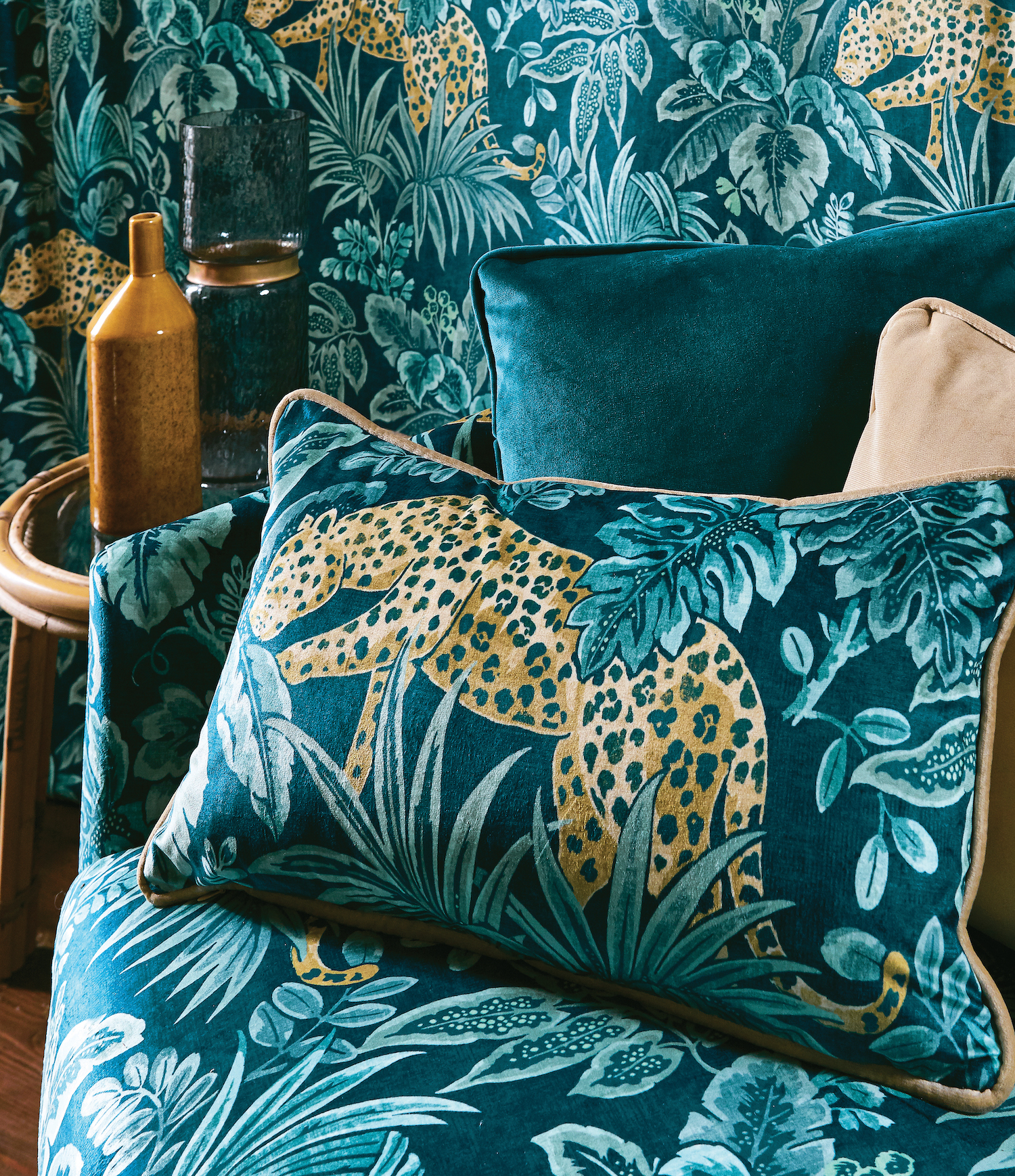
| This opulent and atmospheric wallpaper from Tom Baker immerses you in a world of tropical flora, fauna and exotic animals. With soft cool tones and hints of pink floral detailing, this is the perfect wallpaper to add a relaxing and exciting edge to your home. Find this enchanting collection here. |
 |
| The humble lampshade is often overlooked, but with the new collaboration between Pooky and Matthew Williamson they won't be for much longer! Matthew Williamson has applied his talent to design a new range of Pooky lampshades. Whatever your taste, colour scheme or budget you will find the perfect lampshade for your home in this new collection which is now available. This spectacular new collection can be found here. |
 |
|
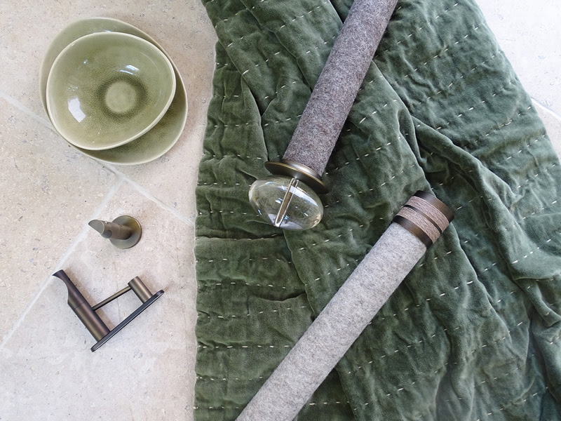
Now you can add some texture to your window dressing with these Walcot House felt covered poles. The pure wool coverings come with a option for bronze or steel fittings and wide spans up to six metres. The curtain track is cleverly hidden within the wooden curtain pole and there's a choice of nearly 50 colours and textures. You can find out more here. |
 |
| I'm really thrilled to have been nominated for an Amara Interiors Blog Award this year! If you enjoy reading my blog and would like to vote for me, I'm nominated in the Best Interior Designer Blog category, and you can vote for me here. |
 |
| Love Rugs, the people who know about all things rugs have just published a feature on the upcoming interiors trends for 2020. They asked six of the UK's top interior designers (including me!) to tell them what the upcoming trends are, and in particular the changes we will be making to their homes. The article can be read here, and if you'd like to have a look at the huge range of rugs they offer, click here. |
 |
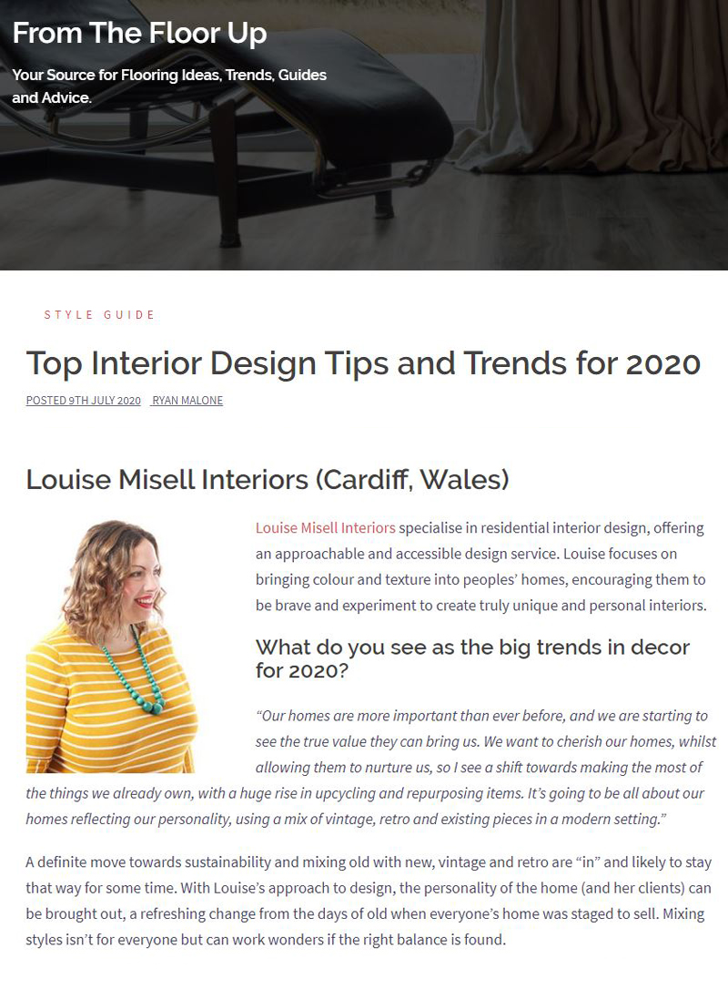
| I love Linwood fabrics - they have a fab way of mixing colour and pattern into something really special, producing fabrics and wallpapers that make me want to coo. This new collection, available at the end of June, is just as gorgeous. It's called Kami, with the pattern inspired by a 19th Century document. The collection is a range of printed velvets, so perfect for upholstery and accessories like cushions. |
 |
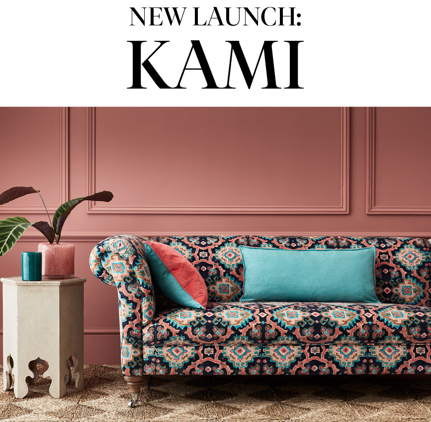
| If you are looking to update your existing Ikea kitchen rather than replace it, Stockholm based company Superfront are here to help. They sell a range of fronts, handles, legs and tops to fit not just the Faktum kitchen range but also the Besta, Metod and Pax ranges - so you can customise anything from your sideboard to your wardrobe. These super cute round handles are part of their new birch collection, and the whole range can be found here |
 |
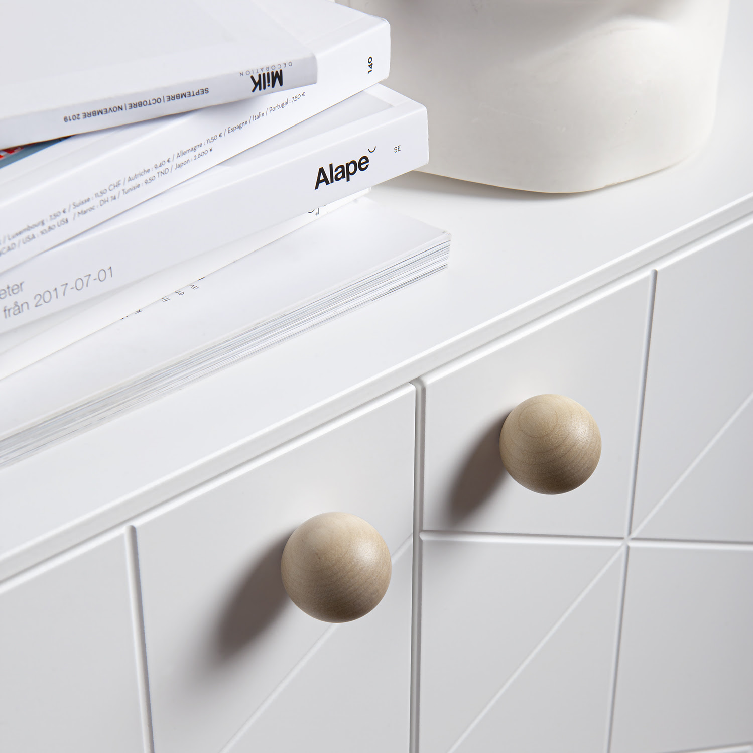
| Colour has been taking over our kitchens and bathrooms for a while now (yay!), and has slowly been creeping into sanitaryware and fittings. These perfectly coloured mint green and pastel pink taps from the new Miami Colour Pop Collection from amazing homeware brand Dowsing & Reynolds are spot on and would look gorgeous in any kitchen or bathroom to add a shot of colour without overwhelming with sugary sweetness. You can learn more about this new collection here. |
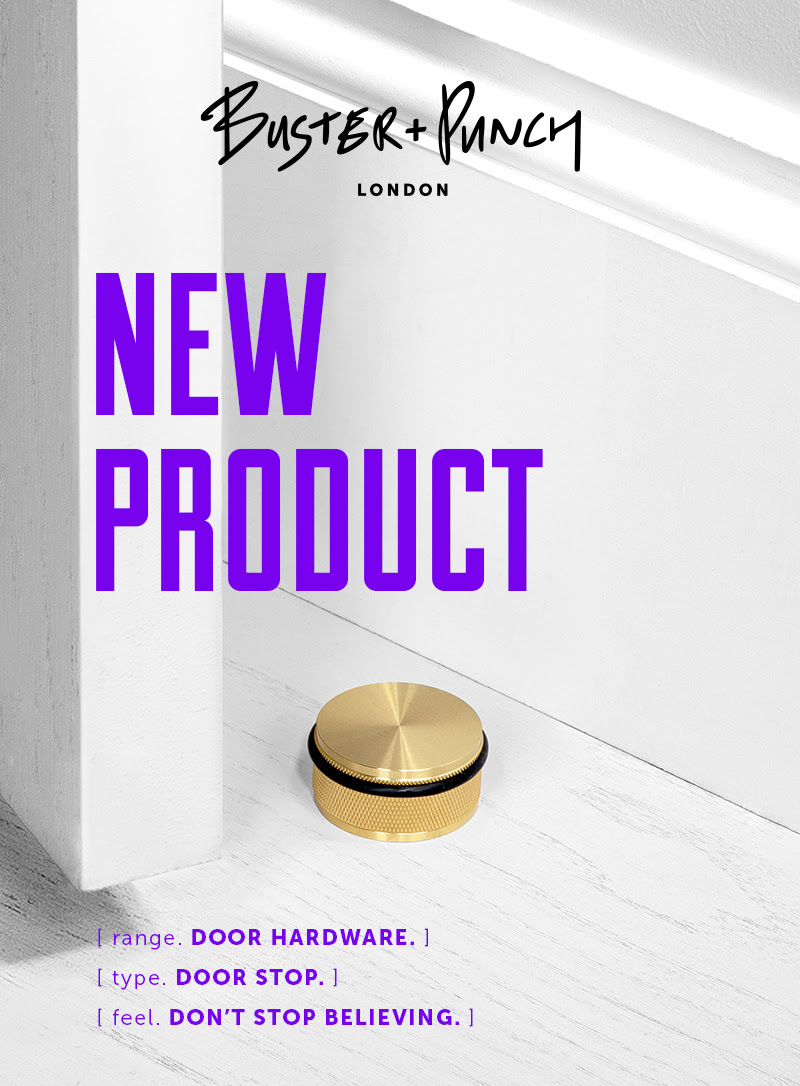 |
| Door stops are one of those little annoying things that we all need, but are not the prettiest to look at. Now London based Buster & Punch have turned their attention to the problem and transformed the humble door stop into something cool and covetable. They might cost more than your average one from a DIY store, but as you're going to see it every day, why not look at something beautiful? here. |
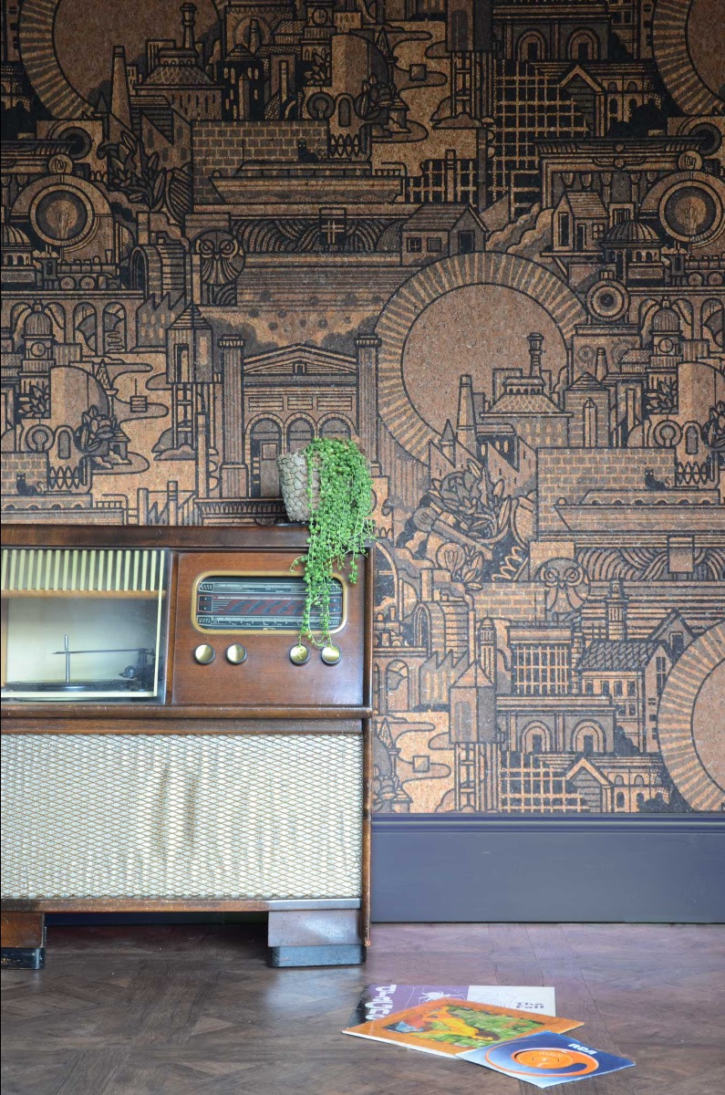 |
| Sustainability and concern for our environment are key in the interiors world right now (as they should be). So when I saw that Monkey Puzzle Tree (a brand I admire for their sense of style and creativity) had produced this wallpaper made of cork, I was blown away. Cork is great for so many reasons - it can be harvested every nine years without harming the tree, is grown without the need for pesticides or fertilisers, has excellent sound and heat insulation properties, and is naturally antimicrobial and antifungal. This wallpaper has an A+ rating for emissions so it creates a healthy environment wherever it is hung. Add to this that the design was produced in collaboration with the talented Drew Millward who lives in my home county of West Yorkshire, and that it's called 'Hit The North', I was bound to fall in love with it. You can buy the wallpaper here. |
 |
|
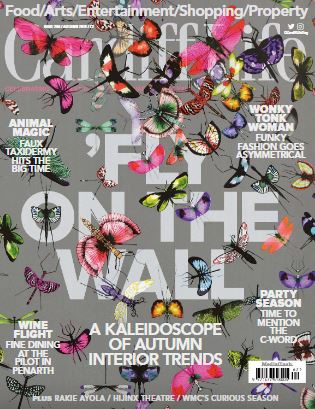
Now that the summer is officially over and our thoughts turn to cosying up our homes for winter, I'm here to help. If you're in need of some inspiration, you can read all about the interiors trends for Autumn and how to work them into your home in this month's Cardiff Life magazine. Hear what I and other interiors experts have to say on pages 18-22. You can read the digital version of the magazine here. |
 |
| Exciting news! My little blog (Design Insider) has been nominated for an Amara Interiors Blog award! I'm so chuffed to be included at all, and not expecting to win, but if you enjoy reading my blog posts then please vote for me. I'm nominated for the Best Interior Designer blog category. Voting is open until the 11th of September and you can vote for me here. |
 |
|
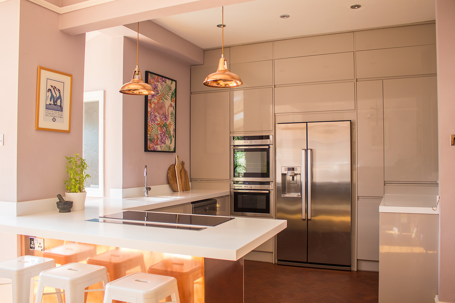
When I designed the contemporary copper kitchen, I wanted to use some copper elements to add warmth and also to tone in with the pink walls and pale grey units. I found these pendant lights from a company called Artifact Lighting, and they are perfect because they add to the 'warm glow' I wanted to acheive. They also have a vintage look which contrasts nicely with the sleek look of the kitchen units. When the kitchen was finished I sent some pictures to Artifact Lighting, and they liked the kitchen so much they featured it on the blog page of their website. You can read the blog page here |
 |
|
One of my favourite interiors brands, House of Hackney, who are known for their daring and quirky prints, have just released a new fabric which is suitable for our door use. They took one of their designs, Palmeral, and reimagined it in a fresh colour palette of off white and green. This colour fast and water resistant fabric can be used for anything from outdoor cushions to furnishing yachts (if you are lucky enough to have one!) |
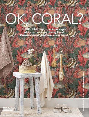 |
| Hear what I and my fellow designers have got to say about Pantone's colour of the year, Living Coral, and how to use it, in this month's Cardiff Life magazine. The article is on pages 84-86, and you can read it here. Do you think you could use it in your home? |
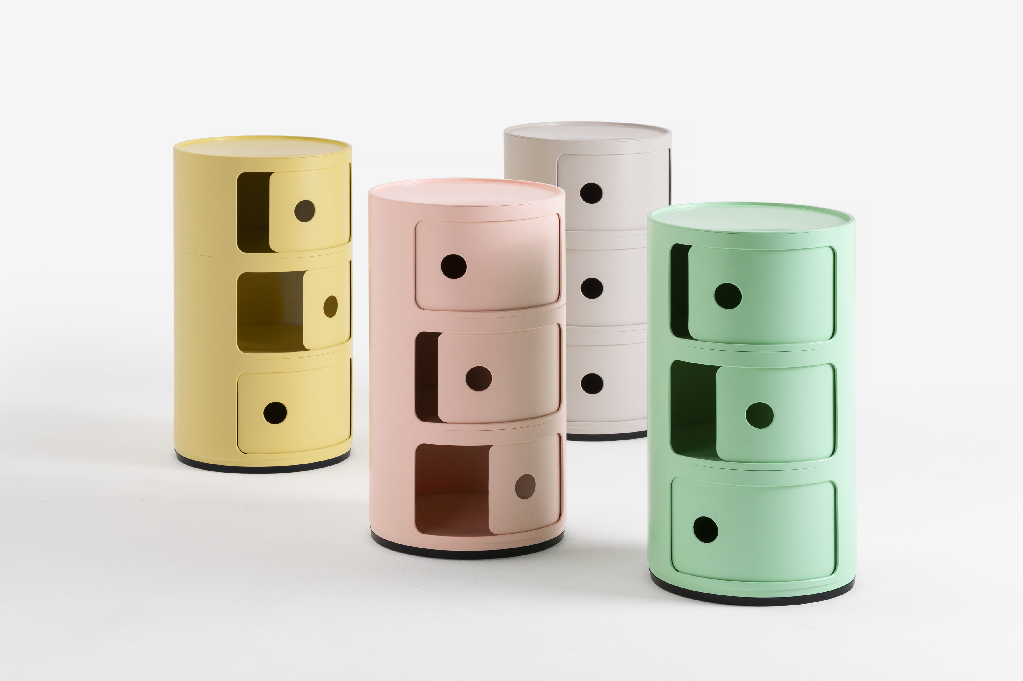 |
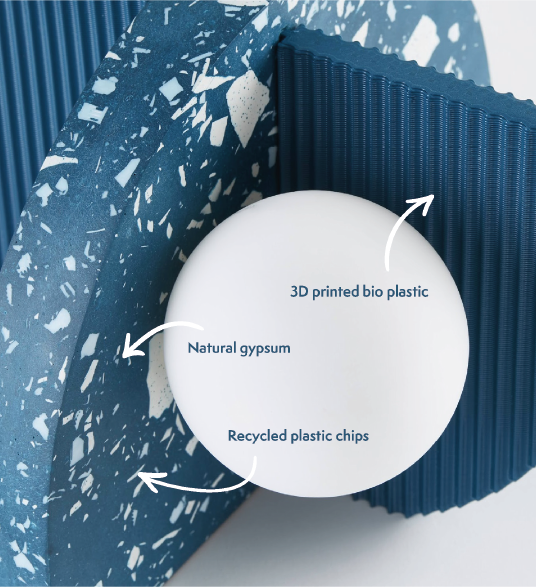
| Sustainability is something that is becoming more and more important in interior design - not just where we buy items from and how far they've travelled to get to us, but also the materials that they are made from. Kartell, one of Italy's best known design brands, have just released the world's first piece of furniture made from a bioplastic called Bio-On. It's a fully sustainable version of one of their best selling items - the Componibili modular unit, and it comes in four delicious pastel shades. They may be 100% sustainable, but they are also super cute and bang on trend with this seasons colours. You can buy them here |
 |
|
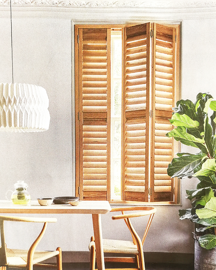
Forget painted shutters - the new style direction for window shutters is bare wood. These full height shutters made from sustainably sourced ash are the newest product from California Shutters, and are set to be big this year. |
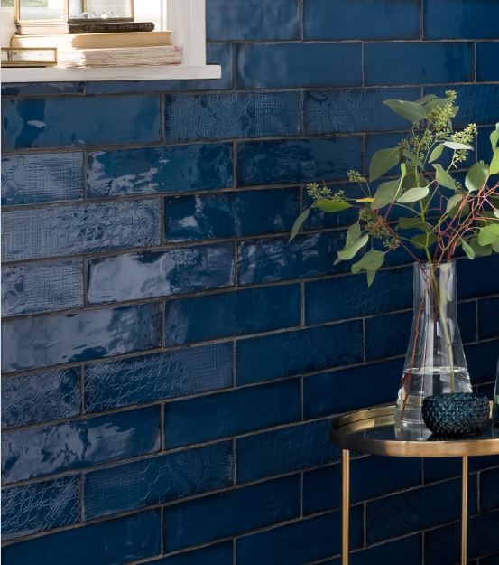
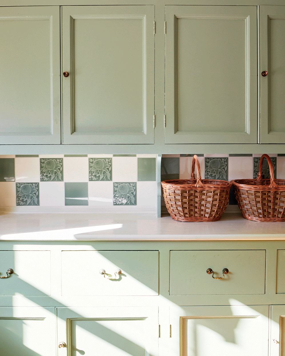
I was searching for some tiles for a client's splashback recently and came across these beauties from Topps Tiles. There's long been a trend for patterned tiles, with lots of geometric shapes and bold colours going on, but I've begun to see more and more tiles with a pattern in the surface of the tile itself. These ones are a lovely example, and the deep blue colour is just stunning. To get a closer look at them, follow the link below.
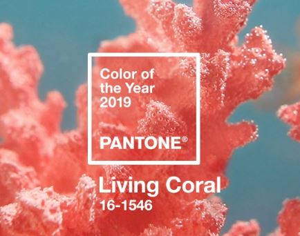
Leading colour experts Pantone have annouced the shade which they think will be the colour of the year for next year - Coral pink. It might look very bright and scary, but it's actually quite easy to use. I wouldn't suggest painting a whole room in it, as that might be a bit overwhelming, but I would use it in small doses, such as on cushions or in artwork, to liven up a shceme. Pantone say that the colour is meant to 'embrace us with warmth and nourishment and provide comfort and bouyancy in our continually shifting envirnoment', which basically means it's a happy, uplifting colour, and might just cheer us all up!
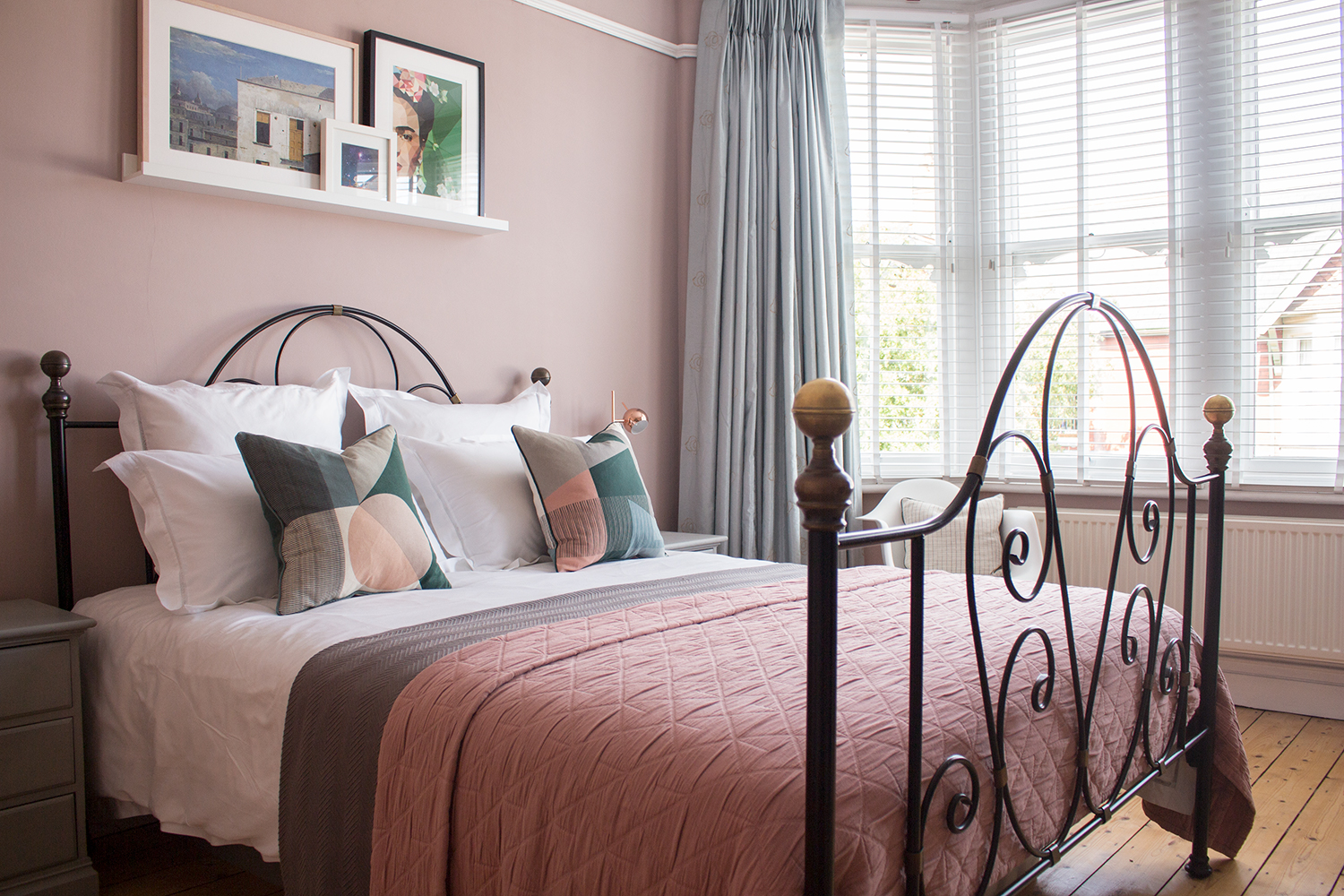 My work has been featured in an article on Homify - one of the leading online ideas platforms for all things interiors. My project is in an article on how to avoid common mistakes when designing a bedroom. The article mentions how important it is to block out light for a good nights sleep - something I addressed by adding blackout lining to the curtains and adding an extra layer of window dressing with the wooden Venetian blinds. To see the article, please use the link below.
Homfy article - Are you guilty of these 8 bedroom design mistakes?